
So last week we started to look at colour in branding, catch last weeks blog here…
Examples of effective brand colour palettes.
The key is to understand which colours will work for your brand, and what those colours say about your business. Do you prefer bolder tones Or more neutral palettes? There are endless brands out there with unique colour schemes that can inspire you. Taking a look at big brands and fortune 500 companies could be the key!
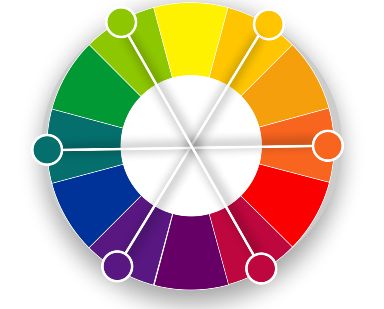
Blue is by far the most popular choice of logo colour for big brands.
It’s easy to understand why blue logos are such a popular choice. Blue is an inoffensive color, a safe but sophisticated hue. And for companies that wish to convey security—say, those in Finance, Tech, Health or Insurance—blue does an admirable job. Twitter, Facebook and Linked In all use this inoffensive colour.
Red, on the other hand, is a statement choice for a brand. It is the second-most popular choice. Red is the color of power. It gets people’s attention and it holds it, which is why it’s the most popular colour palette for marketing. Red can also trigger danger so you want to use the colour sparingly. In the Fortune 500, food and retail industries love red. Think KFC, Coca – Cola and McDonalds.
The colour orange communicates something is affordable yet of reasonable quality. It also reflects sociability and being warm-hearted, so may be a good one for budget service industries (think Easyjet).
We see yellow as a fun, energetic, young, and attention-grabbing. Still, it’s relatively uncommon in the fortune 500 and that may be because its regularly used to warn us of danger.
Purple pops up here and there in the Fortune 500, while pink doesn’t feature at all!
So if pink and purple don’t feature why do we use them at Savvy?
Here at Savvy, our main overarching brand palette for Its All Savvy is turquoise/blue even though we love pink and purple. We use pink for the Savvy Pet Spa and Savvy Beauty and Savvy Nail products and purple for the Savvy Studio platform.
Psychologically, turquoise represents clarity of thought and communication. It inspires self-expression, encouraging people to tune into their own needs. Physiologically, turquoise calms the emotions and recharges the spirit, invigorating depleted energy levels and inspiring positive thought. Turquoise is a beneficial color for any business related to communication, including teachers, trainers, public speakers, media communication and computer technology.
Too much turquoise creates indecision as people swing between the blue energy and the yellow energy that comprises turquoise. Balancing it with either some red, pink, magenta or purple is ideal!
Think of the colours actually inside of Savvy Pet Spa for example, we use turquoise (to help you feel calm and energised and positive and pink is associated with compassion and nurturing, so using your Savvy Pet Spa should be like putting your feet up, doing a bit of meditation and being generally taken care of!! (Ok, well that’s what we’re aiming for!!! 😁).
The major mistakes most businesses make with their brand colours.
The major mistake most businesses make with their brand colors is not having a set color palette at all. It’s important to have one, but often business owners don’t think about it, or don’t pay enough attention to what colors are being used on their website and social media channels.
If you would like help setting up your Savvy Brand colours and logos or Savvy Website. Visit support.itsallsavvy.com and book a demo or check out our how to videos and demos and webinars.